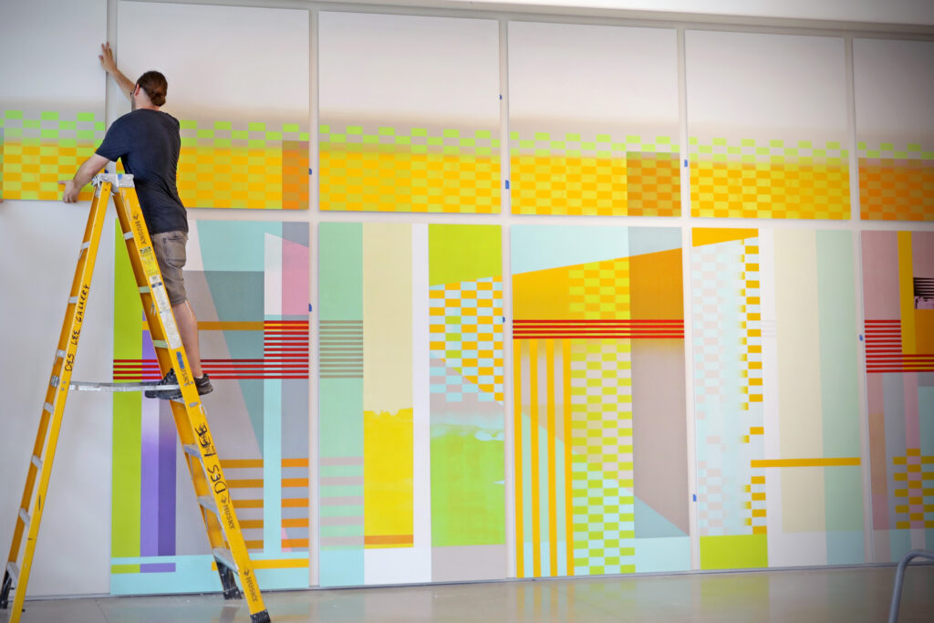
It began with the Goldenrod.
“That’s a really challenging color,” said artist Anne Schaefer. “All the other choices were dictated by that yellow. What can you put next to it that gets really soft, or really intense, or that causes edges to dissolve, or to vibrate?
“Color theory is just endlessly interesting,” Schaefer added. “It’s like low-tech alchemy.”
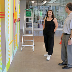
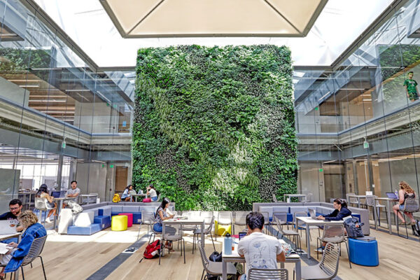
Schaefer is discussing “it comes and it goes,” a 12-panel mural completed earlier this month in Anabeth and John Weil Hall on the campus of Washington University in St. Louis. The new 80,000-square-foot building, which will be dedicated Oct. 2, was constructed as part of the university’s $280 million East End Transformation Project. It will house graduate studios, classrooms and digital fabrication spaces for the Sam Fox School of Design & Visual Arts.
Schaefer, a 2001 alumna, has earned a national reputation for optically immersive paintings and large-scale installations. Last fall, the Sam Fox School commissioned her to create the inaugural Weil Project Wall in the first-floor commons. The piece will remain on view throughout the 2019-20 academic year.
https://www.instagram.com/p/B1ysCrCnjQI/?utm_source=ig_web_copy_link
“Glass is such an important element in this building,” Schaefer said. She points out that the mural’s spacing and proportions were inspired by a nearby bank of windows. “Whenever I work on a large installation, I’m very interested in the cues that the building gives me. What are the dynamics of the space? How will viewers approach the piece? The grid of the glass became my structural point-of-departure.”
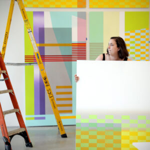
Once committed to the scale of the panels, Schaefer developed imagery by experimenting with a secondary grid, based on color bars commonly used to check density and dot formation in CMYK printing.
“I spend a lot of time thinking about transparency, overlap and optical mixing,” Schaefer said. Subtlety and nuance are built through intricate layers of hand printing, screen printing and digital printing. “I’m constantly thinking about different ways of making, and finding ways to interpret analog marks as digital marks, and vice versa,” she said.
For a typical piece, “I might make some paint scrapes, then photograph them, then digitize those images and put them on a silkscreen,” Schaefer said. “Or maybe I’ll mask something out, then scan the tape residue to generate a new silkscreen. A lot of the mark-making is super iterative.
“I also think a lot about color combinations,” Schaefer added. “This piece only employs 10 colors, which might sound like a restriction, but actually opens things up. Color is really paramount to the work. The same color can look radically different depending on what you put next to it.
“So the color comes from a really functional place. A lot of the visual activity is generated by that forced proximity. Limiting variables provides a level of cohesion and continuity, but it also gives you the opportunity to play.”
