St. Louis is a city that loves its nicknames. We can find a way to abbreviate almost anything, from the Arch, the Loop and the Grove to the Lou. Our alumni may fondly recall reading StudLife in a booth at the Rat or Blue Hill. I think this affinity for nicknames is, at its heart, a reflection of the regional culture: warm and welcoming, informal and inviting, even downright homey.
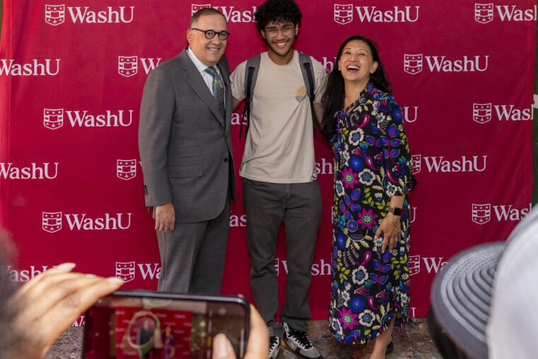
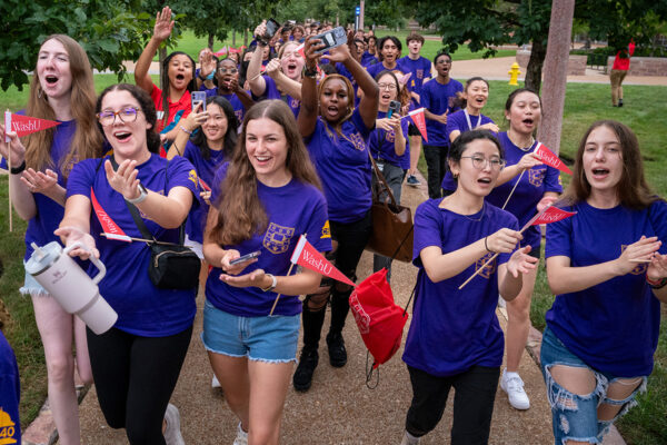
So perhaps it comes as no surprise that when Washington University started looking at ways to refresh our identity, we concluded that nothing represents us more powerfully than the way we refer to ourselves. We debuted the new “WashU” logo this fall with a new washu.edu website, updated signage on campus, and, of course, fresh swag such as T-shirts and laptop stickers for our new and returning students. We even lit up Brookings Hall with the new logo to mark the occasion.
What’s in a name, you ask? I feel that our new logo demonstrates confidence and community, a means of making WashU’s public face match how we already feel and speak about our university. As we considered ways to distinguish ourselves from the other university systems that use the “Washington” moniker, we realized that our homegrown nickname made us unique. There are many “Washingtons.” There is only one “WashU.”
“As we considered ways to distinguish ourselves from the other university systems that use the ‘Washington’ moniker, we realized that our homegrown nickname made us unique.”
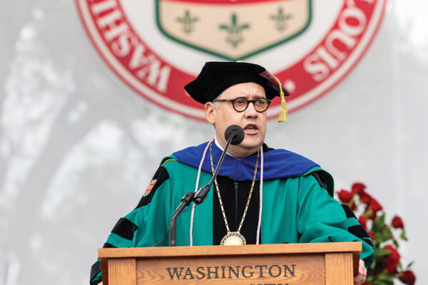
Chancellor Martin
This campaign, our first visual identity update in decades, reflects more than an official name change. We are telling our story in new ways as well, highlighting not only what we have achieved but also how we accomplish our goals, with an emphasis on diversity, collaboration and respect for all. At washu.edu — and here in the pages of the newly renamed WashU Magazine — you can learn about the forward-thinking ways in which we marry the principles that we teach in our classrooms to real-world practices. We celebrate the ways in which we welcome rigorous discourse as part of intellectual growth. We stake a claim as a university that is large enough to produce innovative and important research but close-knit enough to make those breakthroughs because of collaboration between students and faculty members.
That’s a lot to ask of one little logo. But we are betting it will make a big difference in helping us advance our global reputation as a world-class institution.


